back
Shift
Back in early 2022, when crypto was the talk of the town, a friend pitched me an idea that caught my attention. The concept? Shift - a platform where everyday online shopping would earn you crypto rewards. Simple, right? The kind of idea that makes you wonder why it wasn't already a thing.
They needed a brand that could speak to both crypto enthusiasts and everyday shoppers - something that felt innovative but not intimidating. That's where I came in.
Building the Brand
The challenge was pretty clear: create something that felt both cutting-edge and approachable. Crypto already had enough barriers to entry - the last thing we needed was another intimidating tech brand.
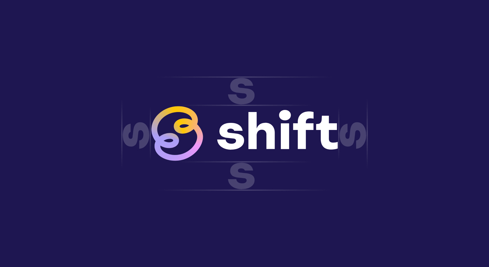
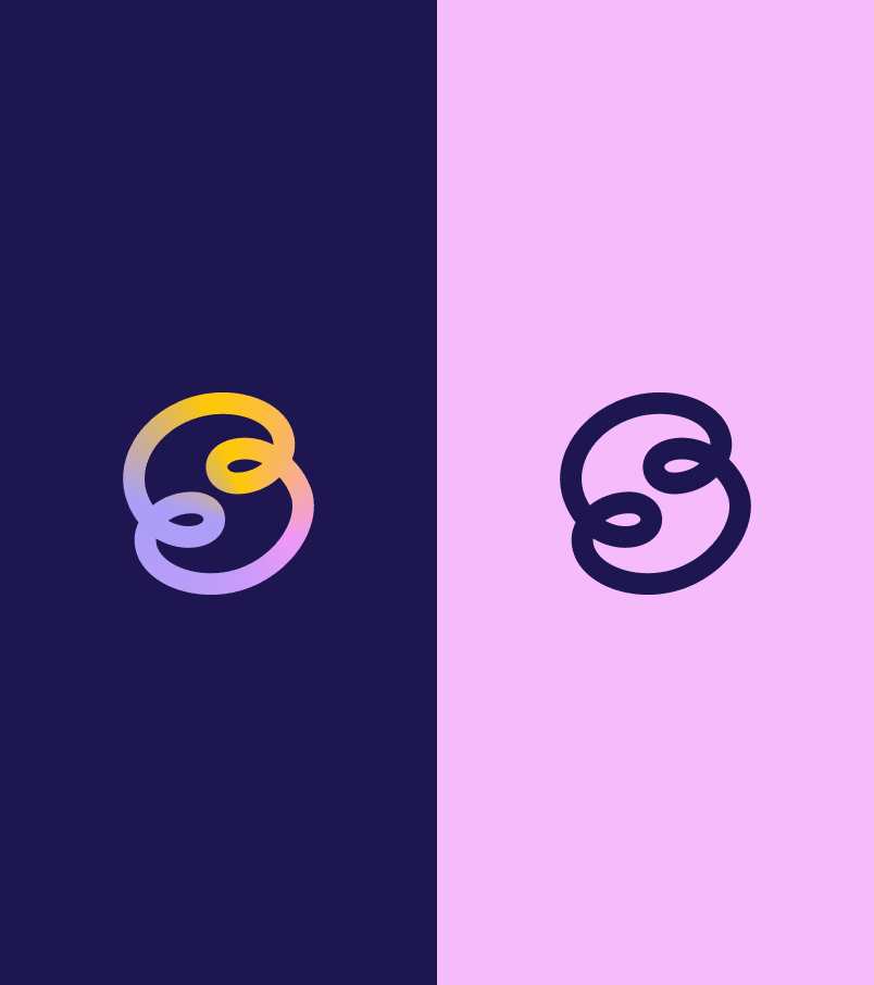
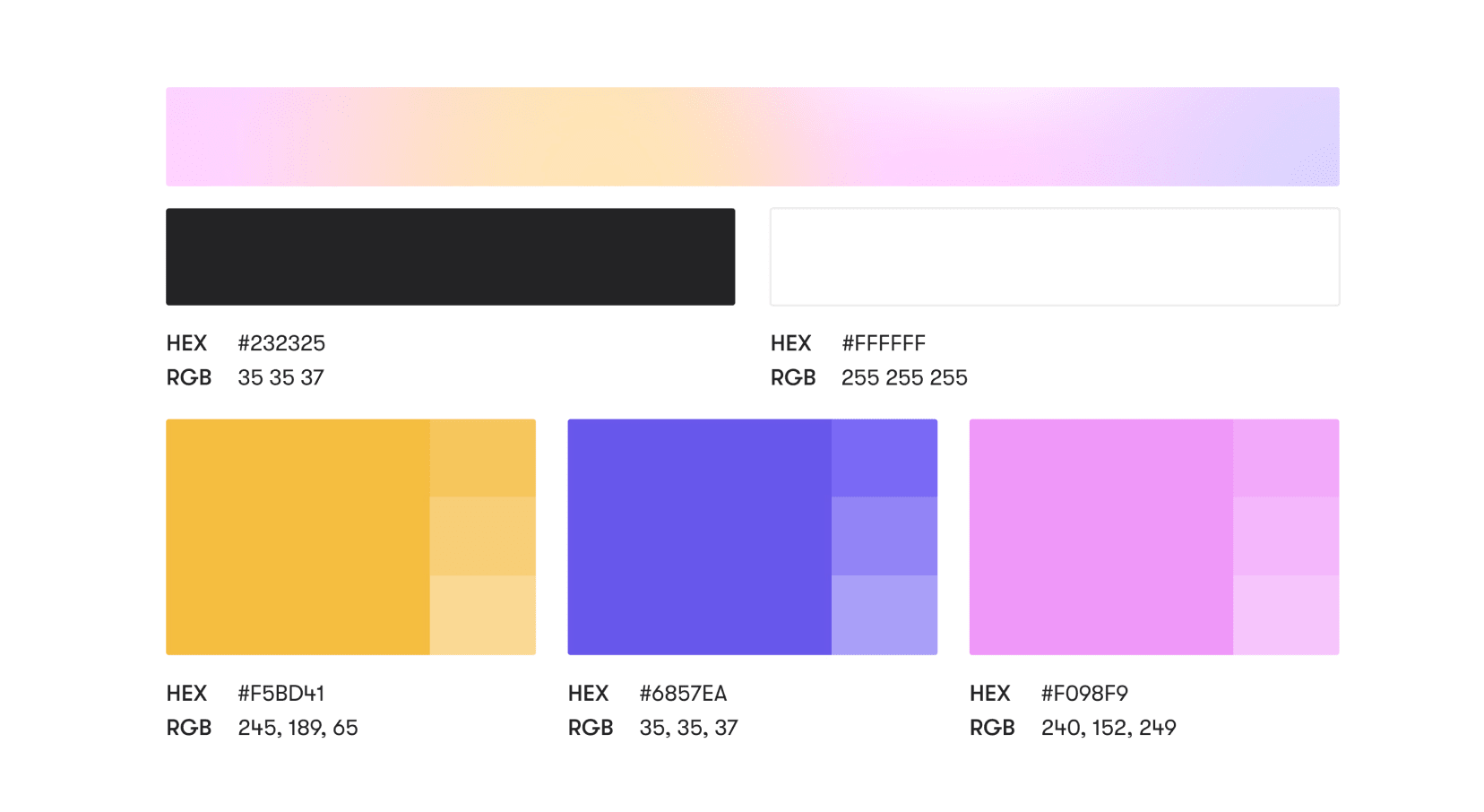
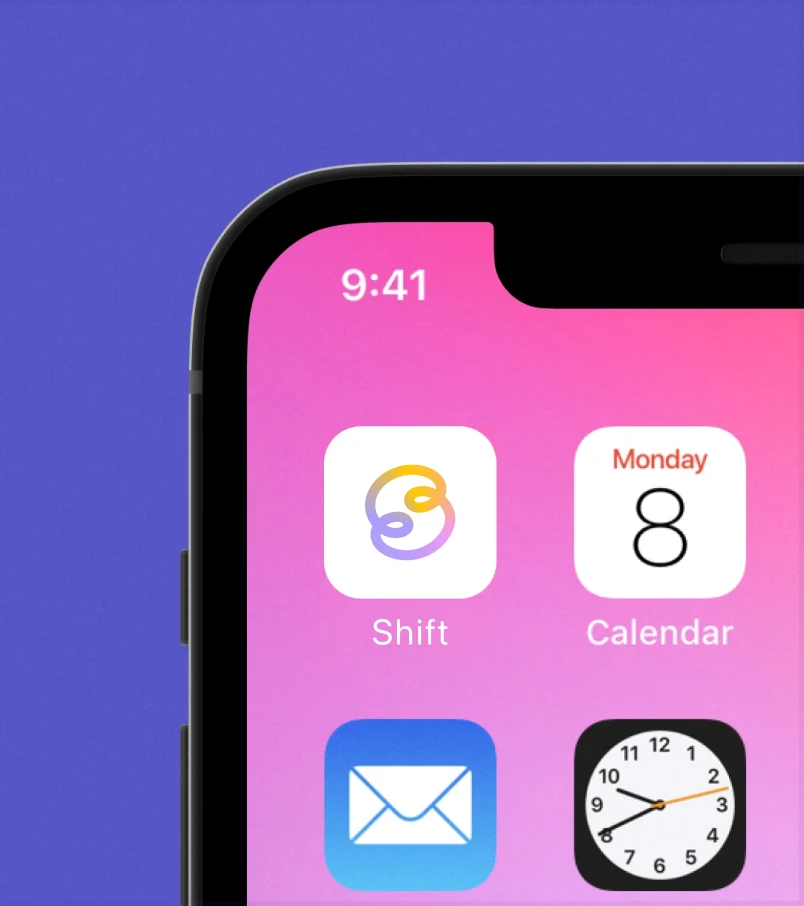
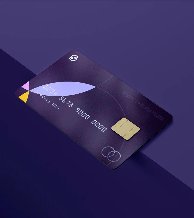
The logo came from playing with the idea of seamless transition - that smooth shift from spending to earning. Two interlocking 'S' forms that create this continuous flow, with gradients that add depth without overwhelming the simplicity.
Making It Move
The real fun started when we brought motion into the mix. That's when the brand really came alive.
Every animation was crafted to reinforce that core idea of seamless transition. The logo morphs and flows, suggesting the fluid nature of digital transactions and rewards.
Beyond the Logo
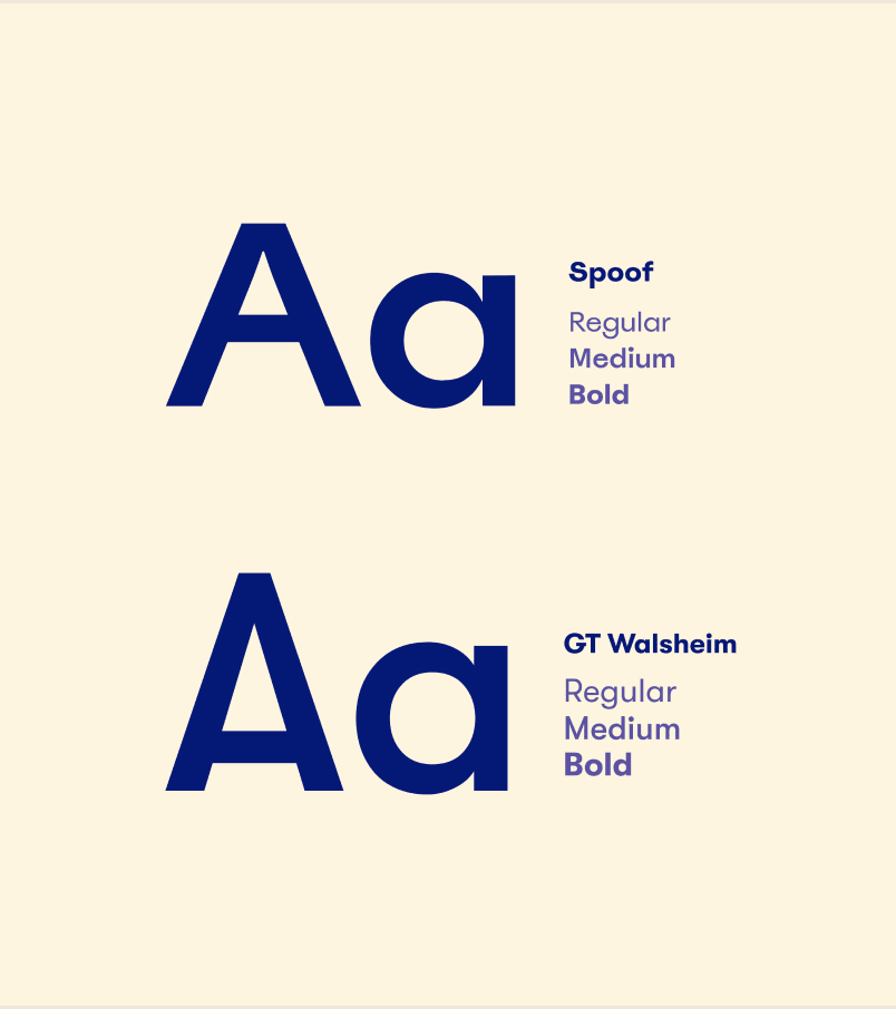
We built out a whole visual system - typography, color palettes, UI elements - everything needed to make the platform feel cohesive and trustworthy.
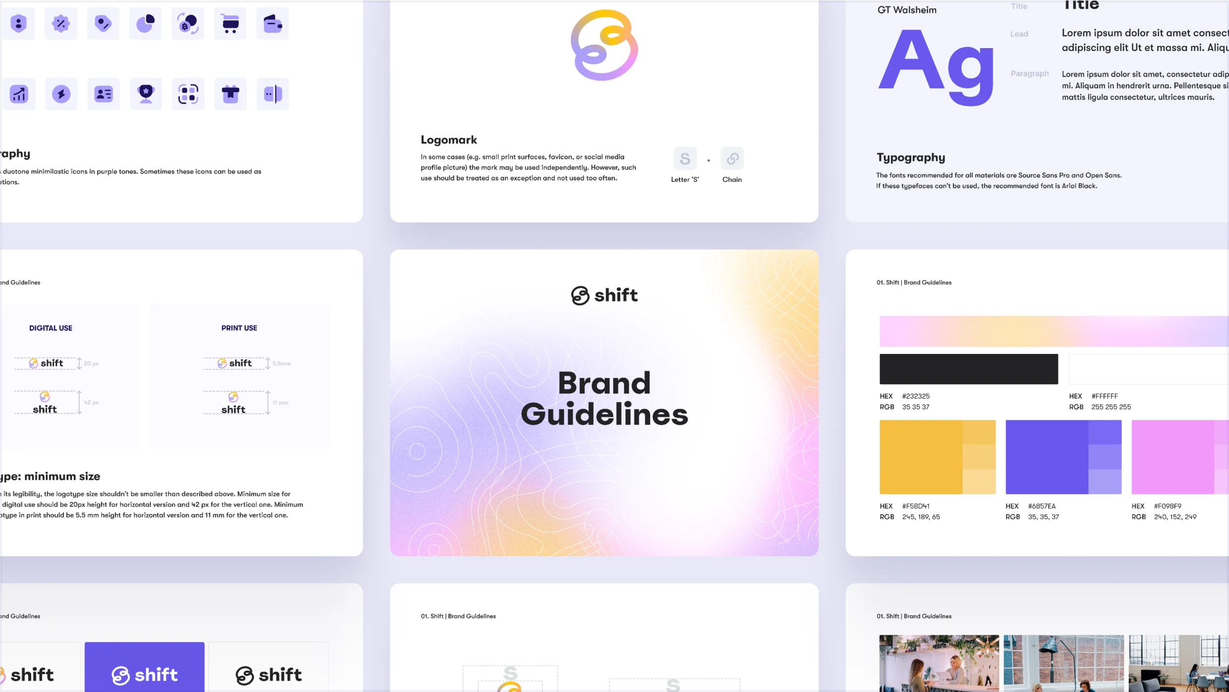
The color scheme balanced tech-forward purples with warmer tones, creating this sweet spot between "future of finance" and "actually pleasant to use."
Plot Twist
Here's where things get interesting. As 2022 rolled around, the crypto landscape started shifting (pun intended). AI was becoming the new hot topic, and my friend decided to pivot the company in that direction.
While Shift as a crypto rewards platform didn't make it to launch, the project was a masterclass in brand design for emerging tech. It taught me tons about making complex ideas feel accessible and exciting - lessons that keep paying dividends in my work today.
Looking Back
Sometimes the best projects are the ones that evolve in unexpected ways. Shift might have changed course, but the challenge of creating a brand that could bridge the gap between cutting-edge tech and everyday users? That's the kind of problem I live for.
Plus, watching those animations still brings a smile to my face. Can't really ask for more than that.